Page 1 of 2 12 LastLast
Results 1 to 20 of 27

Thread: Signature Competition Voting

  1. #1

    Signature Competition Voting

    1st place in voting: 10 points
    2nd: 7 points
    3rd: 5 points
    4th: 3 points
    5th: 1 point

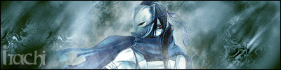
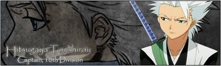
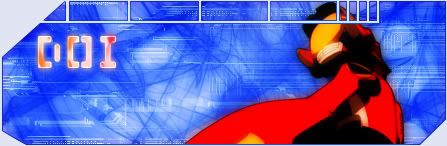
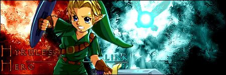
    DO NOT VOTE FOR THE ONE WITH YOUR FAVORITE CHARACTER VOTE FOR THE ONE YOU THINK LOOKS THE BEST

    (And Mut I made sure I saved them all then re-uploaded them so you don't know who made what [img]i/expressions/face-icon-small-tongue.gif[/img])

    1)Foomanchew

    2) Dragunzero

    3) NarutoMaster

    4) Eurasian

    5) Gaaralovessand

    6) DOI

    7) PSJ

    8) Kage

    9) Itachi_y2k5

    10) Alhuin

    names are in :/

  2. #2
    Jinchuuriki Knives122's Avatar
    Join Date
    Mar 2004
    Location
    That place over there........ahh never mind
    Age
    36
    Posts
    3,130

    Signature Competition Voting

    question: wasnt the due date(aka, the day we would start voting) on the 22nd?

    R.I.P Captain America.

  3. #3

    Signature Competition Voting

    Well you should have paid more attention to the forum, everyone but you turned theres in, even like 3 new people. We all wanted to start it because it was taking too long. Sorry.

    Is your sig done atleast? I can throw it in if it is.

  4. #4
    Jinchuuriki Knives122's Avatar
    Join Date
    Mar 2004
    Location
    That place over there........ahh never mind
    Age
    36
    Posts
    3,130

    Signature Competition Voting

    oh well, i said i was going to drop out anyway if I got too lazy, and I guess I did; so in that case I'll just vote now.

    R.I.P Captain America.

  5. #5

    Signature Competition Voting

    whoa there well good i cant choose which to vote for >.<

  6. #6
    Banned SK's Avatar
    Join Date
    Apr 2004
    Location
    Amherst, MA
    Age
    35
    Posts
    2,007

    Signature Competition Voting

    that itachi sig is off the chain.

  7. #7
    Photoshop Hero Alhuin's Avatar
    Join Date
    Jun 2004
    Location
    Planeptune
    Age
    35
    Posts
    997

    Signature Competition Voting

    Hmm... all great sigs. It was definitely a tough choice. *Can we say which one we voted for? Or is it strictly anonymous?*

    It's dangerous to go alone. Take Nep.

  8. #8

    Signature Competition Voting

    Gyaa. I was going to deliver. Is it too late? Anyways nice sigs people

  9. #9
    Jounin Honoko's Avatar
    Join Date
    May 2005
    Location
    New York
    Posts
    964

    Signature Competition Voting

    i wanted to vote 10 but all those words just ruined the images... so 4 it is!

  10. #10
    Photoshop Hero Alhuin's Avatar
    Join Date
    Jun 2004
    Location
    Planeptune
    Age
    35
    Posts
    997

    Signature Competition Voting

    Originally posted by: Honoko
    i wanted to vote 10 but all those words just ruined the images... so 4 it is!
    I personally thought the words fit perfect. It gave a nice feel to the sig...
    Sure they probably could have used a better font... and maybe maneuverd them around differently... but I still believe they fit well. Just by the image of Ichigo holding his sword, it seems like the text goes with it. The text brings a "determined" feeling to the sig, I believe...

    It's dangerous to go alone. Take Nep.

  11. #11

    Signature Competition Voting

    FINE ! ill edit it then sk !

  12. #12
    Jounin Honoko's Avatar
    Join Date
    May 2005
    Location
    New York
    Posts
    964

    Signature Competition Voting

    Originally posted by: Alhuin
    Originally posted by: Honoko
    i wanted to vote 10 but all those words just ruined the images... so 4 it is!
    I personally thought the words fit perfect. It gave a nice feel to the sig...
    Sure they probably could have used a better font... and maybe maneuverd them around differently... but I still believe they fit well. Just by the image of Ichigo holding his sword, it seems like the text goes with it. The text brings a "determined" feeling to the sig, I believe...
    Oh, the words by themselves are fine. I just dislike it when they're running across images like that. I can't take a visual seriously if a line of text happens to end right at the dude's armpit. The whole point is, the size of the letters are fighting w/ the imagery. For sigs, I'd rather see a focus on imagery, and minimal text (or at least, non-interfering text). besides, this is my opinion and u're free to ignore it.

  13. #13
    Banned SK's Avatar
    Join Date
    Apr 2004
    Location
    Amherst, MA
    Age
    35
    Posts
    2,007

    Signature Competition Voting

    he didnt say he made the sig, you did.

  14. #14

    Signature Competition Voting

    You guys are never gonna guess who made that badass winning itachi sig.

    And its not me.

  15. #15
    Moderator Emeritus NM's Avatar
    Join Date
    Mar 2004
    Age
    36
    Posts
    1,800

    Signature Competition Voting

    I also happen to know who made that sick sig [img]i/expressions/face-icon-small-happy.gif[/img]. That Itachi sig is absolutely perfect. Great job ???? [img]i/expressions/face-icon-small-wink.gif[/img].
    This fantastic Sousuke sig was made by the one and only Lucifus! Thanks man!

  16. #16
    ANBU Captain Hikyuu's Avatar
    Join Date
    Feb 2005
    Location
    Bmore
    Age
    37
    Posts
    528

    Signature Competition Voting

    Ugh.. I wasnt paying attention and almost voted for 10 then I realized that the car one wasnt 10.. its your sig... >< ' :[img]i/expressions/face-icon-small-tongue.gif[/img]alm to forhead.::

  17. #17
    Moderator Emeritus Assertn's Avatar
    Join Date
    Jul 2003
    Location
    Hollywood
    Age
    41
    Posts
    11,053

    Signature Competition Voting

    Originally posted by: Honoko
    Originally posted by: Alhuin
    Originally posted by: Honoko
    i wanted to vote 10 but all those words just ruined the images... so 4 it is!
    I personally thought the words fit perfect. It gave a nice feel to the sig...
    Sure they probably could have used a better font... and maybe maneuverd them around differently... but I still believe they fit well. Just by the image of Ichigo holding his sword, it seems like the text goes with it. The text brings a "determined" feeling to the sig, I believe...
    Oh, the words by themselves are fine. I just dislike it when they're running across images like that. I can't take a visual seriously if a line of text happens to end right at the dude's armpit. The whole point is, the size of the letters are fighting w/ the imagery. For sigs, I'd rather see a focus on imagery, and minimal text (or at least, non-interfering text). besides, this is my opinion and u're free to ignore it.
    Now you guys are getting into Typography.
    A field that focuses entirely on the arrangement of words, the spacing of letters, the balance between negative/positive space, and even the tiny seriffs at the ends of the characters.

    In other words....The way words lead our eyes and balance a composition is so important, that there is a whole field dedicated to it. Honoko's got the idea.
    10/4/04 - 8/20/07

  18. #18
    ANBU Nai's Avatar
    Join Date
    Jun 2004
    Location
    #Sanitarium
    Posts
    427

    Signature Competition Voting

    Voted for the Itachi sig. Slick, stylish and simple.
    / No, you warrant no villain's exposition from me.

  19. #19

    Signature Competition Voting

    Ok votings done, I'm making the new round, you can lock this.

  20. #20

    Signature Competition Voting

    I don't recommend putting a link in the Naruto forum...

Posting Permissions

  • You may not post new threads
  • You may not post replies
  • You may not post attachments
  • You may not edit your posts
  •