View Poll Results: Which ava/sig looks the best?

Voters
33. You may not vote on this poll
  • Entry 1

    7 21.21%
  • Entry 2

    23 69.70%
  • Entry 3

    3 9.09%
Page 1 of 2 12 LastLast
Results 1 to 20 of 21

Thread: DF's Sig Contest --- Start Voting!

  1. #1
    Moderator Emeritus NM's Avatar
    Join Date
    Mar 2004
    Age
    36
    Posts
    1,800

    DF's Sig Contest --- Start Voting!

    Well everyone, here are the entries for DF's contest. Remember! First place gets an increased signature size, a custom title, and DF's sig/ava gets changed to you're submission. Second place gets the increased sig size. Good luck to the participants!

    To the voters, after you select you're pick, it'd be nice if you could post why you chose that particular sig. I'm sure the artists would like to know what you all think as well.

    Entry 1 (Sig size is 125 X 125...but its ok):
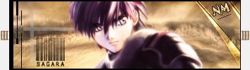


    Entry 2:


    Entry 3:


    As per DF's rules, the poll will run for one week. So the poll will close on August 28 at 7:30 PM EST.
    Last edited by NM; Tue, 08-21-2007 at 07:59 PM.
    This fantastic Sousuke sig was made by the one and only Lucifus! Thanks man!

  2. #2
    Awesome user with default custom title RedX1z's Avatar
    Join Date
    Jun 2005
    Age
    36
    Posts
    1,233
    It's was a pretty tough choice, because two of them don't really say "good bye", but rather "pretty signature" in my opinion. Even though I tend to be into the flashy signatures, I'm going with the first one since I think it has the right idea of good byes and farewell, I think.
    Last edited by RedX1z; Tue, 08-21-2007 at 06:52 PM.
    Signature by Lucifus

    She knows what you did last summer..

    ------------私はコピーX 及びSimca が空を征服することを信じる------------

  3. #3
    I went with the second one. I think it kind of has the theme of "goodbye"...plus it doesn't make my eyes bleed unlike the other two.

  4. #4
    Moderator Emeritus masamuneehs's Avatar
    Join Date
    May 2005
    Location
    a fountain pourin' like an avalanche, comin' down the mountain
    Age
    38
    Posts
    3,874
    i'll wait for the avatar for sig 3... since right now it's between that one and the first (kudos to number two for a different avatar, though, as 1's is just part of the sig, and i've never been a big fan of that...)

    I like number two alot, although it'd honestly be better without the 'Goodbye' crest thing on the right side, in my opinion. The rectangles at the top also seem to clash with whatever is going on with the border. Finally, I'm not a big fan of empty space, and the black on the ends just doesn't do it for me. The 'heat' effect looks pretty good, but, yeah. Well that's my thoughts... The borders on the avatar are a bit strange too. Good looks on the 'DF' there, though.

    I immediately looked at sig 3 and said, "too much going on here", but on taking a closer look, i like. I'm a sucker for oversaturation and the Saber render stands out well with the darker, emptier background. The little sword thing might remind me of a 16 bit cartridge game, but I actually like it and it goes well with the whole feel of the sig, which reminds me of an old stained glass panel in a church. The second line of text is a little hard to read. Let's see that avatar!

    Sig 1, pretty simple at first, but I always liked the 'pixelation' effect going on on the left (left bottom mostly) and it goes well with the border. The text is on subject, like Red said, and not bad at all. The choice of render is questionable, as I don't quite see it fitting with the words in the text. Even a bit more with the avatar in any respect would have helped.

    good work to whoever made 'em! They are all pretty damn snazzy

    Humans are different from animals. We must die for a reason. Now is the time for us to regulate ourselves and reclaim our dignity. The one who holds endless potential and displays his strength and kindness to the world. Only mankind has God, a power that allows us to go above and beyond what we are now, a God that we call "possibility".

  5. #5
    Procacious Polymath Ryllharu's Avatar
    Join Date
    Mar 2004
    Location
    American Empire
    Age
    39
    Posts
    9,873
    I'm going to have to refrain from voting until the third avatar is up as well, but I'll give some feedback on each of them for now. Being critical is good, and I'll try to be harsh. But first off, all of this is way beyond my level of skill, so either way, they're very good.

    Entry 1:
    The sig is fantastic, text with a point that also happens to be quite fitting. In general, the image plucks at the right strings to fit the theme, and we'll definitely miss DF. I like the colors as well. Like Masa, I'm really not a fan of using the same image in the sig and avatar. It's a big thing for me.

    Entry 2:
    Again, I've got to agree with Masa, the 'goodbye' crest is the first thing that draws your eye, but then it clashes with the rest of the signature. I don't have a problem with the rectangles, they add a very nice border effect to the whole thing. The avatar and sig are very nice image choices. The angle of the two Saber images give a "moving on" feel, as well as a bit of longing, a nice fit for the theme. Definitely my favorite of the two avatars shown.

    EDIT:
    Entry 3:
    I like the rendering, but it's just too busy. I like the mosaic, but I don't think the text fits well. It's another copy from the sig, but it's modified a little, unlike Entry 1. Despite that, it strangely matches well.

    That all said, I voted for Entry 2.
    Last edited by Ryllharu; Tue, 08-21-2007 at 09:07 PM.

  6. #6
    Moderator Emeritus NM's Avatar
    Join Date
    Mar 2004
    Age
    36
    Posts
    1,800
    The avatar for entry 3 has been added.
    This fantastic Sousuke sig was made by the one and only Lucifus! Thanks man!

  7. #7
    Banned darkshadow's Avatar
    Join Date
    Apr 2005
    Location
    Phantom Zone
    Age
    38
    Posts
    4,117
    well, this is pathetic? I say give it another week or two, 3 submissions to vote between just sux.
    -----------------

  8. #8
    Genin Iridani's Avatar
    Join Date
    Jul 2007
    Location
    Canada
    Age
    36
    Posts
    164
    Tough choice to make here... but let me think...

    Entry 1:
    This one's pretty awesome with the text that gives off the "feeling" of farewell rather than just saying "goodbye" or the like. It reads to me something that DF would have actually said himself. Plus the fact that the text may be faded but it's "still there" I happen to like The colors themselves work well together with the pixelations and it just all around fits even if the avatar is a perfect match.

    Entry 2:
    This one here is quite good as well... although I'll have to agree and say that the 'goodbye' is a bit much and too out there to blend in with the rest of the signature. I also like the fact of the different avatar to go with it... both Saber are standing strong like DF would have wanted. Good job here.

    Entry 3:
    The text doesn't really fit in with the rest of it and all in all it's a tad much for my tastes. The avatar itself is almost a perfect copy to the sig but with some added detail with the initials and slight bordering which in itself is pretty good. Unfortunately too much going on in the end for me.

    Well... I've made my choice I think on which one I like best. Too bad there were only three submissions to choose from! I would have liked to see at least five to give things a shake up. I would have made something myself but unfortunately don't have what I need on this temporary computer :P Anyway good luck and thank you to all who entered and can't wait to see who wins!
    ~The imprint is always there... Nothing is ever really forgotten...~
    ~Seduce my mind, and you can have my body
    Find my soul, and I'll be yours forever...~
    ~Signature made by Deadfire~

  9. #9
    Moderator Emeritus masamuneehs's Avatar
    Join Date
    May 2005
    Location
    a fountain pourin' like an avalanche, comin' down the mountain
    Age
    38
    Posts
    3,874
    voted 3. sorry. it was between 1 and 3 for me, and 3 did a bit more with the avatar (though not much as compared to sig 2). that's all for me for now.

    Humans are different from animals. We must die for a reason. Now is the time for us to regulate ourselves and reclaim our dignity. The one who holds endless potential and displays his strength and kindness to the world. Only mankind has God, a power that allows us to go above and beyond what we are now, a God that we call "possibility".

  10. #10
    ANBU Augury's Avatar
    Join Date
    Dec 2003
    Location
    California
    Age
    40
    Posts
    460
    I voted for 2. The main appeal for me was the color setup: I felt that the others were too bright or had a jarring contrast, and I favor faded light colors. The transition or flow of the second sig felt smoother. I also liked the rectangles and the border effect that they had. The different avatar was a plus.

  11. #11
    Remnant of Woot Lucifus's Avatar
    Join Date
    Sep 2005
    Location
    Photoshop, Eclipse, Notepad
    Age
    33
    Posts
    1,949
    I wanted to enter two submissions. Can't say which of the above is mine but I'm sure everyone knows who the artist of each is already just by the styles.


    Think it fits the goodbye theme a bit better.
    Don't believe in yourself, believe in me, who believes in you.


  12. #12
    Awesome user with default custom title RedX1z's Avatar
    Join Date
    Jun 2005
    Age
    36
    Posts
    1,233
    Wow, that's pretty impressive. It's a shame that didn't make the cut as well. The avatar gives it more pluses.
    Signature by Lucifus

    She knows what you did last summer..

    ------------私はコピーX 及びSimca が空を征服することを信じる------------

  13. #13
    Wild Card Fool RyougaZell's Avatar
    Join Date
    Aug 2004
    Location
    Mayonaka TV
    Age
    43
    Posts
    5,593
    #2
    Has better render. Could do withouth the 'goodbye', but liked it more than the other two's phrases.

  14. #14
    Junior Sexfiend PSJ's Avatar
    Join Date
    Jul 2003
    Location
    At a bar
    Age
    35
    Posts
    5,104
    Entry 2. is without a doubt the best one. The overall look of the sig fits with the render and it looks like the artist knew what he/she wanted to do. all of them are a bit to bright on the render though. The first and third one needs some work on the bg. All of them needs some work on the renders to.

    But overall it looks nice, good work guys and/or gals.

  15. #15
    Entry 2. They're all good, but I liked it best.

    Entry1: Pretty nice. I like the colors, you could've worked more on the bg and I don't like the font.

    Entry2: Nice bolors and bg. Didn't like the bars though.

    Entry3: Less is more. I didn't like your bg, too much stuff. I like your sig

    Lucifus: Too bad you didn't submit that. It would've won easily.

  16. #16
    Remnant of Woot Lucifus's Avatar
    Join Date
    Sep 2005
    Location
    Photoshop, Eclipse, Notepad
    Age
    33
    Posts
    1,949
    Hehe, thanks. But it looks like I choose well with my selection.

    If I wins, I can just throw my name onto it and change the sayonara to something like Saber Fanboy or something as such.

    I wish people would quit voting for entry #2 and vote for the other 2 entries. Second place still gets the sig size increase.
    Don't believe in yourself, believe in me, who believes in you.


  17. #17
    Lasers? Cookies? FTW!
    (universally beloved
    moderator ex-emerita)
    KitKat's Avatar
    Join Date
    Aug 2004
    Location
    Vancouver, BC
    Age
    41
    Posts
    1,649
    Well, looks like #2 is winning by a lot, and that's my favourite as well (gee, I wonder which artist has that lovely sig style? )

    I voted for #3 however, since the second place competition is going to be tough, I think. I liked the quote and the colour scheme on the first one, but the render has jarring dark lines around the hand, and the image is not really suited to the quote at all. In the third one, I like the render choice, with Saber looking up and looking ahead. I like the flow of the lines in that one too, and the mosaic effect is a neat background that you don't see often.

  18. #18
    All look great... The picture in #2 is better, but I think the text clashes, so I picked #1, where the text is more in style with the feeling of the image.

  19. #19
    Dammit I forgot about 2nd place.....now Im regretting that I never entered.

  20. #20
    Graphics Whore Phoenix20578's Avatar
    Join Date
    Aug 2005
    Location
    Jersey
    Age
    36
    Posts
    1,879
    Wow, I missed a bit didn't I lol. Sorry to hear your leaving bro. Had I known sooner, I would've entered myself.

    As for the sigs:

    The first seems a little to distorted. nothing in it feels very clear to me. The color choice for it was done very well though, and makes up for it somewhat.

    The 2nd one is my fav. It was very well done. My only problem with it is that the fire aura around the render seems like a little much. Its a little too distracting, but it was done really well overall.

    The third one was the most clear, but it has too much going on in it to get my vote. The mural effect was a great touch thou, and I would love to see the effect on another sig by that artist in the future. I've been toying with that effect myself and it isnt the easiest effect to make work 100% of the time.


    For all you awesome people, it's just Phoenix. The numbers are just the amount of times people misspell it.

Posting Permissions

  • You may not post new threads
  • You may not post replies
  • You may not post attachments
  • You may not edit your posts
  •